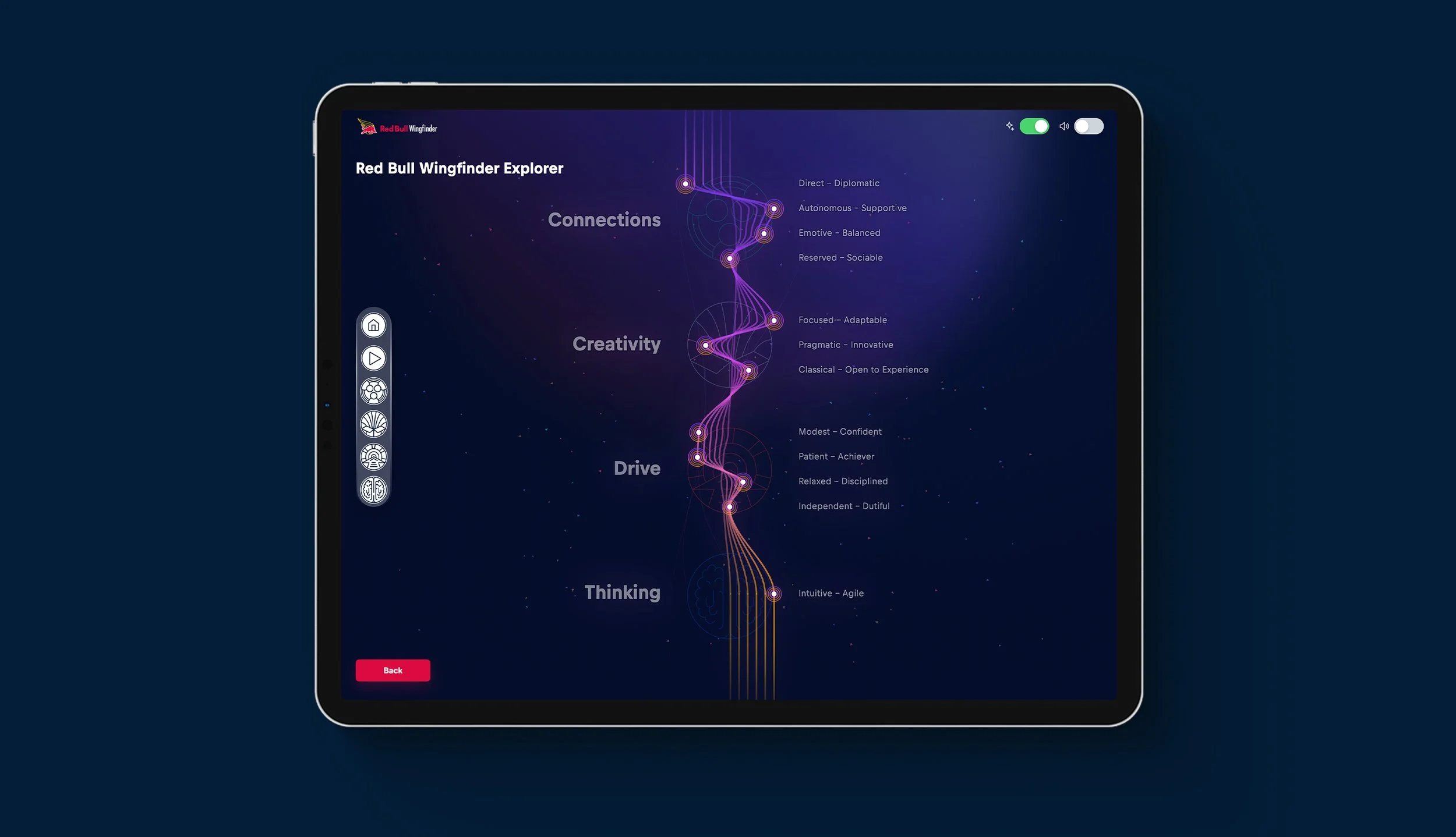
Strengths Explorer

Interactive Strengths-Based Experience
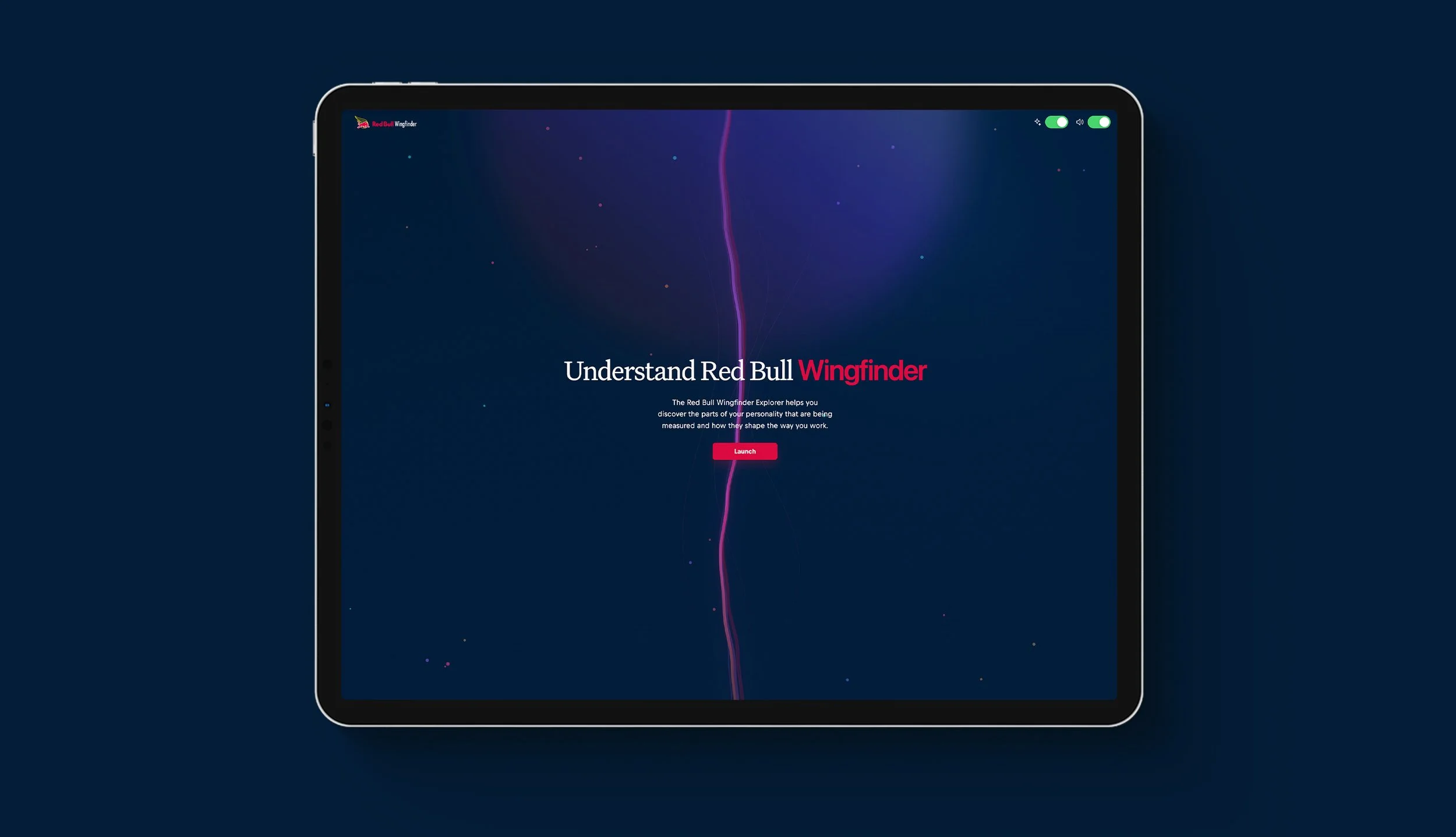
An interactive digital experience for Red Bull designed to help individuals explore, understand, and develop their personal strengths through engaging visual storytelling and interactive content.
The Strengths Explorer platform brought together UX, UI, bespoke graphics, illustration, and animation to transform strengths-based learning into an accessible and visually engaging digital experience.
The project focused on translating personal development concepts into an intuitive, brand-led experience that encouraged exploration, reflection, and engagement. Through a combination of structured content, interactive elements, and animated visual storytelling, the platform aimed to make learning about individual strengths more approachable and memorable.
-
UX/UI Design, Graphic Design & Animation
Led the UX and UI design of the interactive digital experience.
Developed the overall visual direction, page layouts, and interaction patterns.
Created bespoke graphics and illustrated assets to support the learning content.
Designed animations and motion graphics to bring the experience to life.
Worked to ensure visual storytelling and interaction design supported the learning objectives.
Maintained consistency with Red Bull's distinctive brand identity.
Considered usability, performance, and technical implementation throughout the design process.
-
The challenge was to communicate strengths-based learning in a way that felt engaging, personal, and easy to understand.
Key considerations included:
Translating personal development concepts into clear and accessible digital content.
Creating an experience that encouraged users to explore and reflect on their individual strengths.
Moving beyond traditional text-heavy learning materials through interactive visual storytelling.
Balancing expressive graphics and animation with usability and readability.
Maintaining a consistent visual language aligned with Red Bull's brand.
Designing an intuitive journey that supported different sections of learning content.
Ensuring visual assets and animations worked efficiently within the technical requirements of the platform.
The goal was to create an experience that made personal development feel engaging and relevant while helping users recognise and better understand their strengths.
-
The project was approached as a combined UX, visual design, and motion experience, bringing together interaction design, illustration, and animation to support a cohesive learning journey.
1. Structuring the Learning Experience
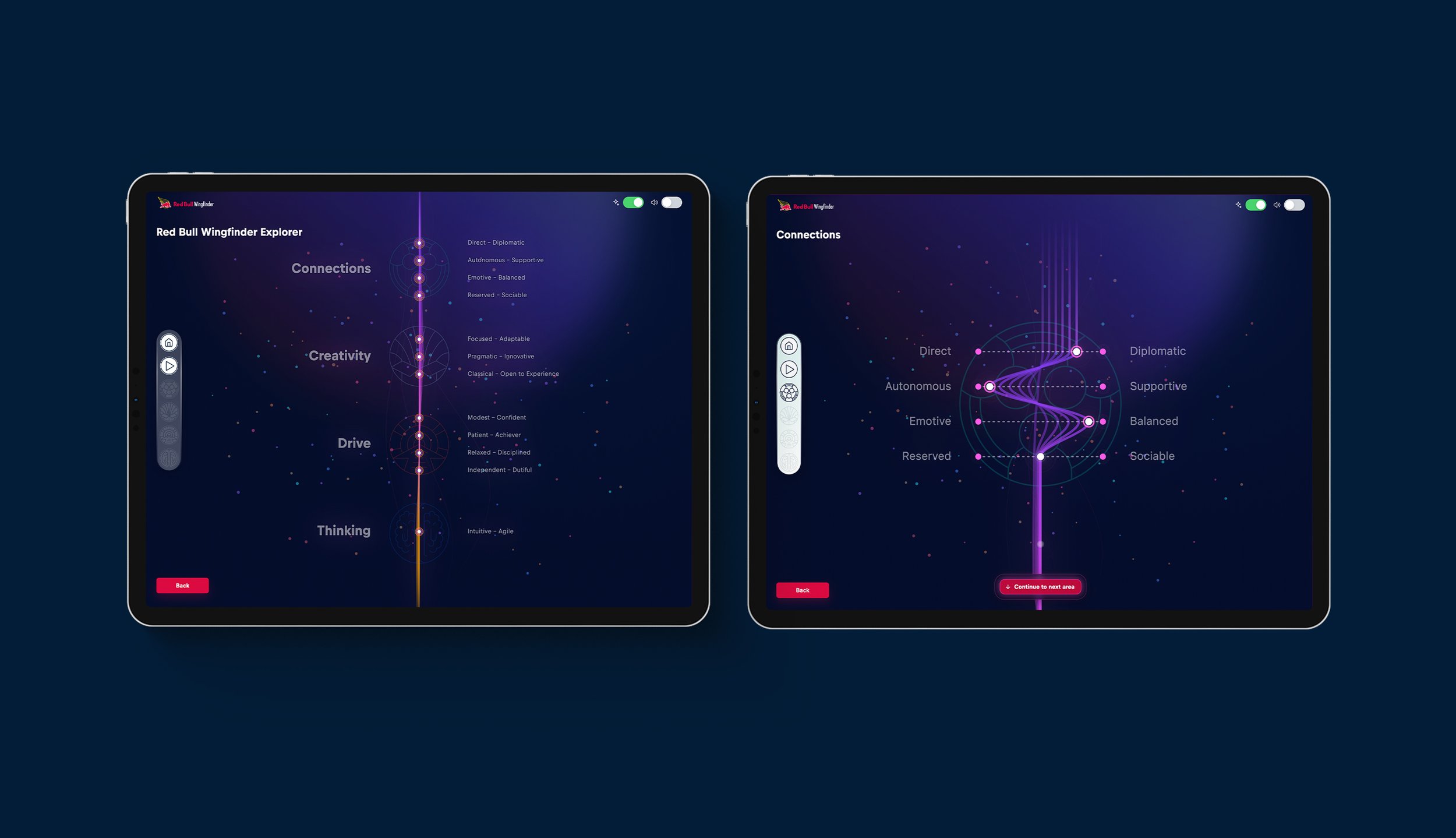
Organised the content into clear, manageable sections that encouraged exploration and progression.
Designed intuitive navigation and interaction patterns to help users move naturally through the experience.
Established a clear information hierarchy to make personal development concepts easier to understand and engage with.
2. Creating a Distinctive Visual Language
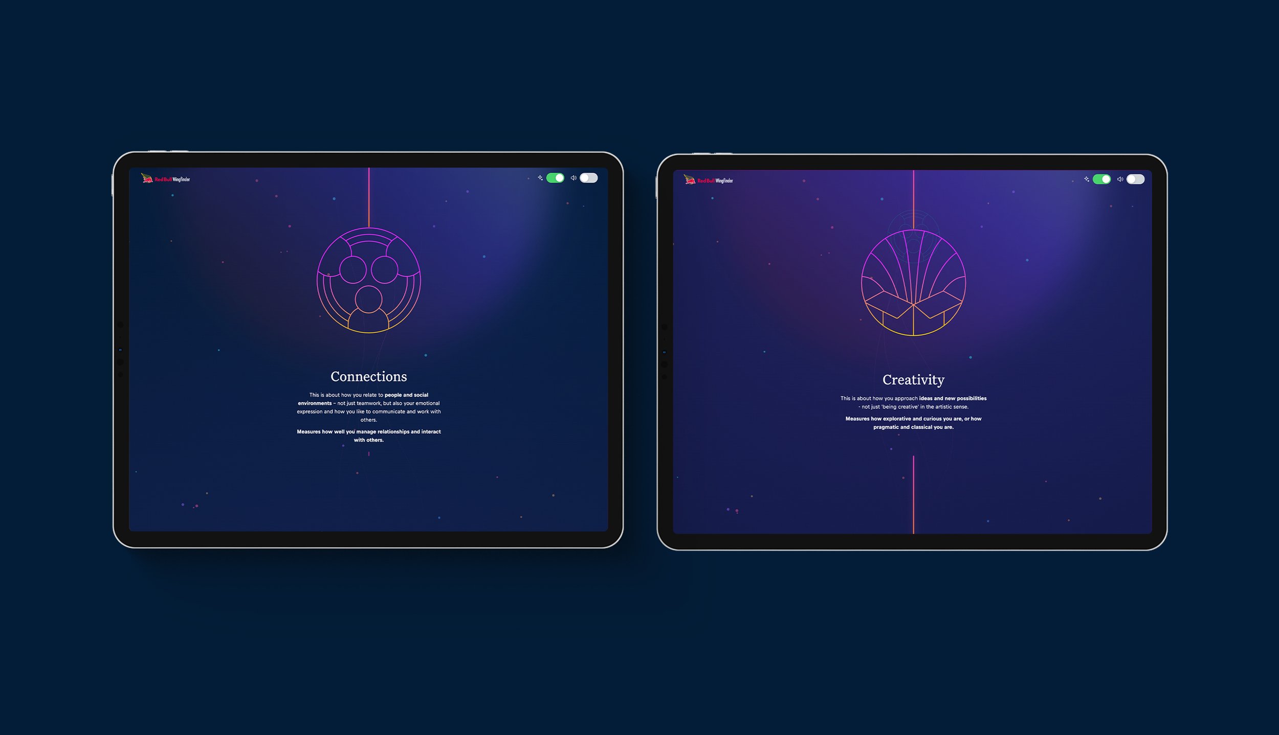
Developed bespoke graphics and illustrated assets to communicate key concepts and reinforce the learning content.
Used Red Bull's brand identity as the foundation for a bold, energetic, and recognisable visual style.
Balanced expressive visual compositions with clear typography and structured layouts to maintain readability and usability.
3. Bringing the Experience to Life Through Animation
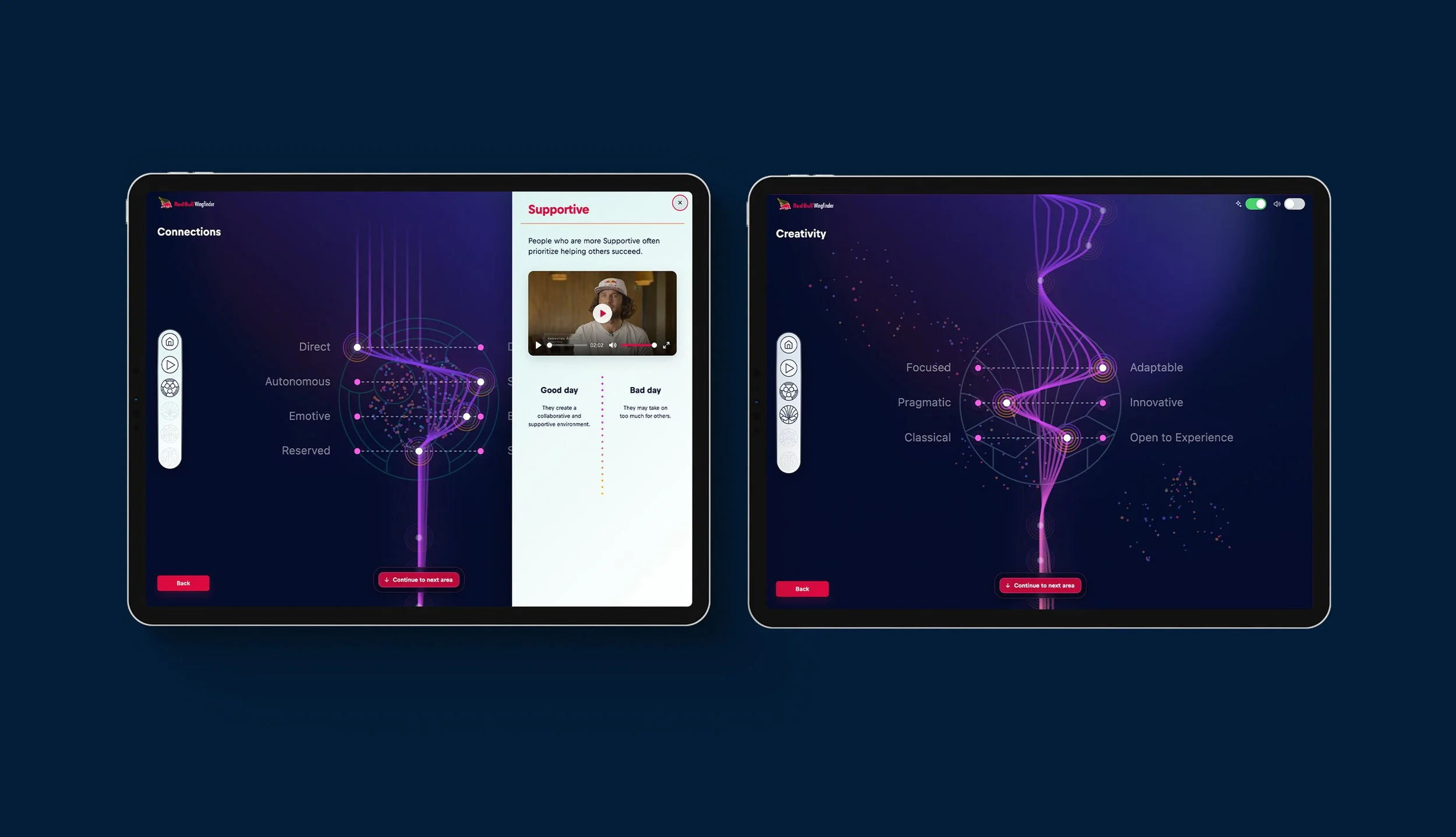
Created animations and motion graphics to introduce movement, personality, and visual interest throughout the platform.
Used animated storytelling to support the communication of strengths-based concepts and maintain user engagement.
Designed transitions and interactive visual elements to create a more dynamic experience.
Considered animation timing and pacing to ensure movement complemented the learning journey rather than distracting from the content.
4. Balancing Creativity with Usability
Designed interactions that encouraged exploration without introducing unnecessary complexity.
Considered how graphics and animated assets would perform within the technical constraints of the platform.
Maintained consistency across navigation, content sections, and interaction states.
Focused on ensuring the experience remained intuitive and accessible while delivering a distinctive visual identity.
-
The experience translated Red Bull's energetic and performance-driven identity into an interactive personal development platform.
Visual Language: Bold, expressive, and engaging, using bespoke graphics to communicate strengths-based concepts.
Typography & Layout: Clear and structured to support readability and content exploration.
Motion & Animation: Used to introduce personality, reinforce storytelling, and guide attention throughout the experience.
Interaction Design: Encouraged exploration, reflection, and progression through intuitive interactions.
Consistency: A cohesive visual system connecting content, graphics, navigation, and motion.
The result was a distinctive digital experience that reflected Red Bull's brand personality while making personal development content more approachable.
-
From a product perspective, Strengths Explorer was designed to support:
An interactive learning journey focused on understanding personal strengths.
Clear and intuitive navigation across learning content.
Visual storytelling through bespoke graphics, illustration, and animation.
Engaging interactions that encouraged exploration and reflection.
Consistent presentation of information across different sections of the experience.
A flexible digital experience that balanced brand expression with usability.
The result is a product that functions as both:
An interactive strengths-based learning resource.
A brand-led digital experience combining UX, UI, graphics, and motion.
-
Outcomes
Designed a cohesive interactive learning experience centred on personal strengths and development.
Transformed abstract learning concepts into a more visual and approachable digital format.
Created a distinctive visual language through bespoke graphics and animation.
Brought UX, UI, illustration, and motion together into a consistent experience.
Balanced expressive visual storytelling with clear navigation and usability.
Delivered a digital experience aligned with Red Bull's energetic brand identity.
Key Takeaways
Visual storytelling can help make abstract personal development concepts easier to understand.
Animation and interaction design can encourage exploration and strengthen engagement with learning content.
Combining UX, UI, graphics, and motion from the outset creates a more cohesive digital experience.
Strong brand identities can be expressed through interaction without compromising clarity or usability.
Effective learning experiences balance creativity with clear structure and intuitive progression.